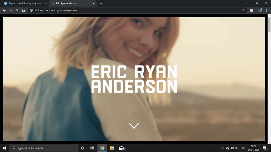
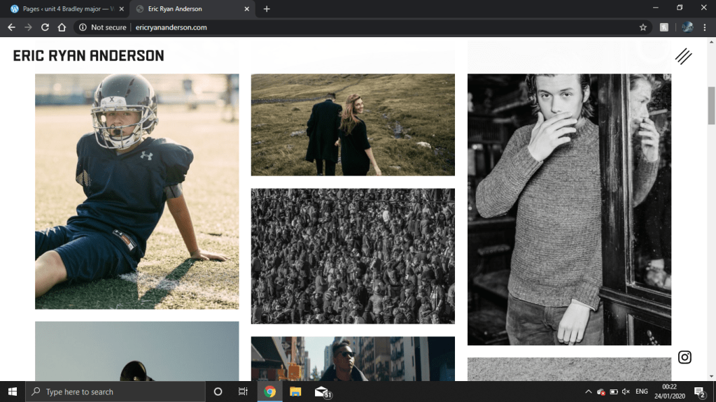
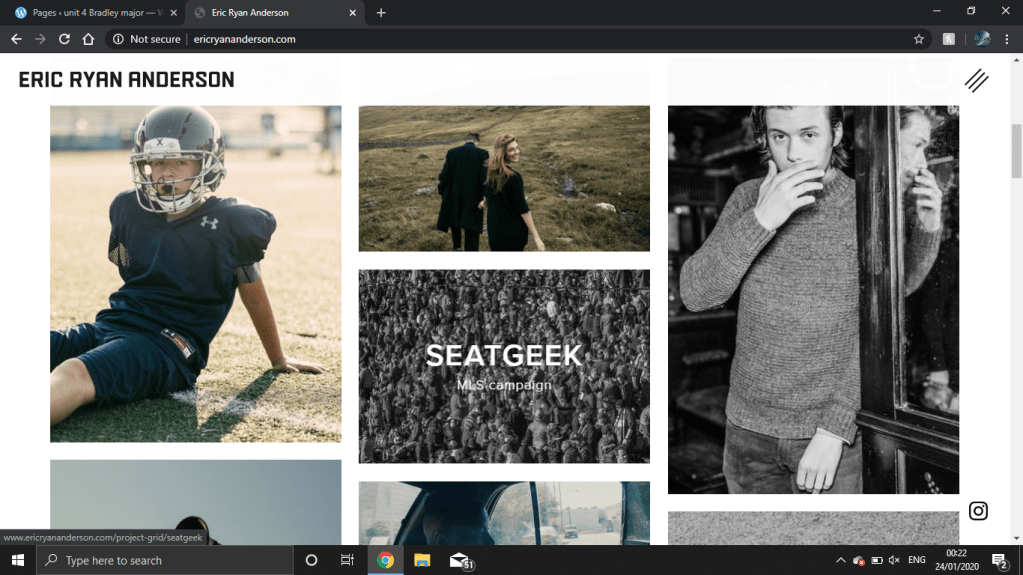
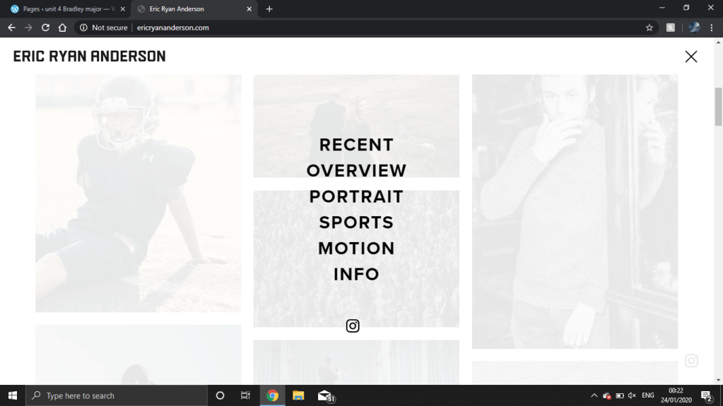
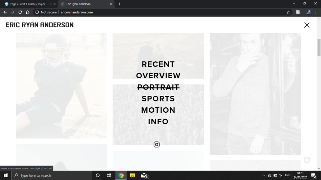
Eric’s website is really well made i like as soon as you lode up the website you are grated with a video i like this and i don’t because its nice and something to look at but then it may have been better with some example of his work but either way i like it. When you scroll down you can see all of his images that is set out in a grid type layout which is one of my favorite type of layout the photos are like thumbnails because when you click on one it takes you state to the rest of the photos from that shoot which is a easier way to find a specific photoshoot and it doesn’t cram more photos in the home page which helps it look more tidy and the other thing i like about the home page is if you hover over a image it goes black and it tells you who the photo shoot was for and where it was taken or it tells you some information about the images. I think this website is easy to use and easy to get around and if you can’t find what you are looking for you can click the three bars in the corner and it comes down a pop up menu with tabs to get to some were quicker but i thing this could be changed a bit because i didn’t know what that was until i accidentally pressed it so Eric could improve by making this more noticeable but i still liked it because it looked good and i do like it. i think the way how Eric communicates himself as a photographer really well because all his image are in a nice neat grid with labels and a nice thing he added was in his about me page he has included most if not all of the celebrities who he has worked with which will help his reputation because they might see someone and think he did photos for a certain celebrity and think i want him to take photos of me so then he will get more clients.