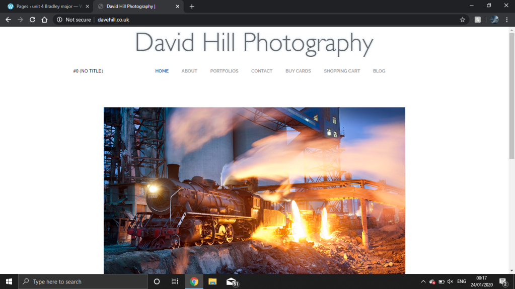
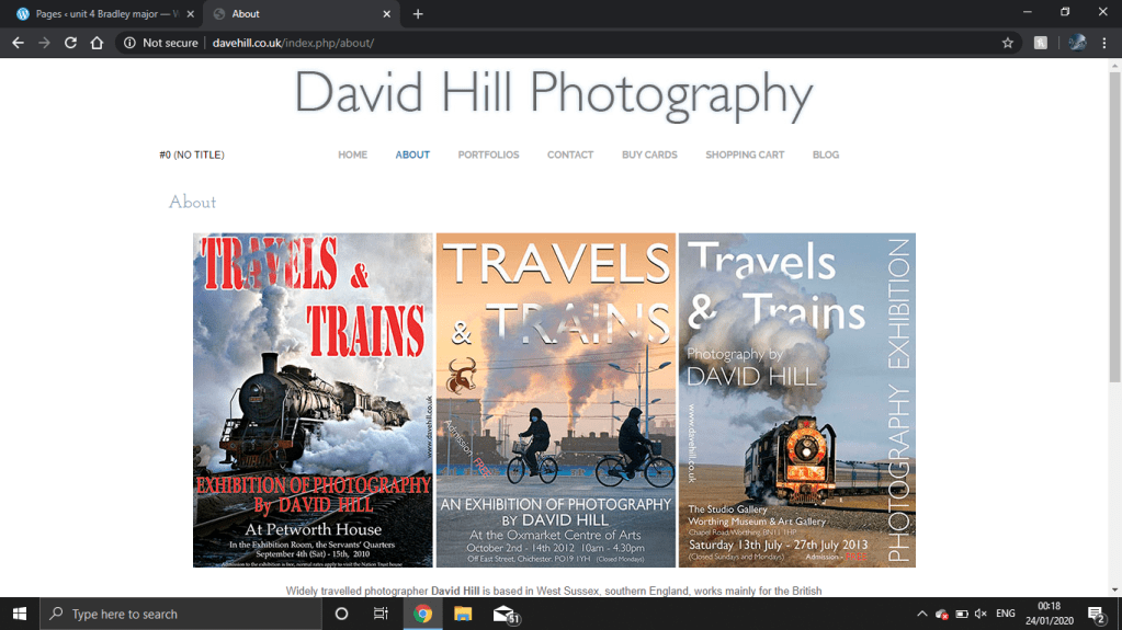
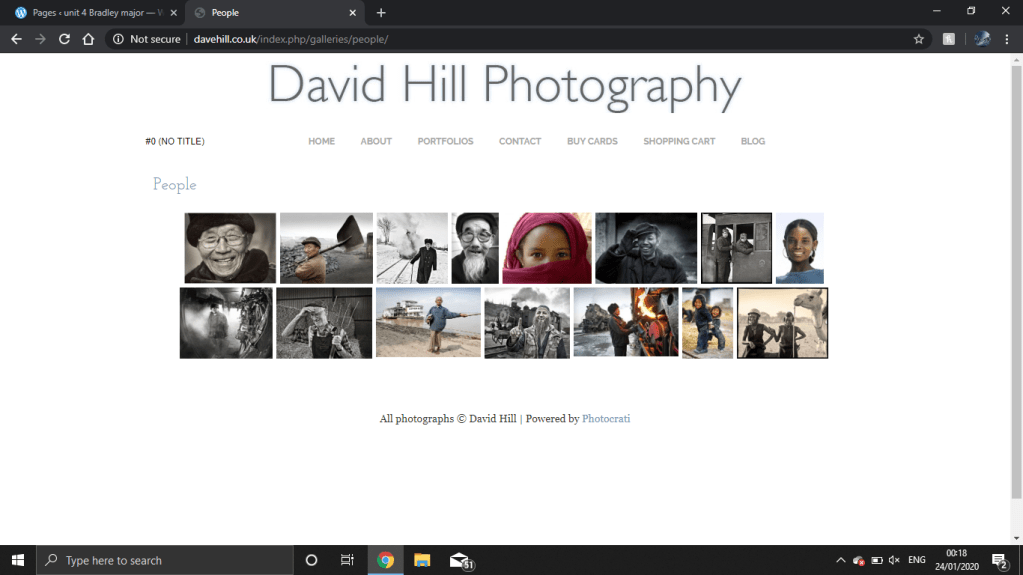
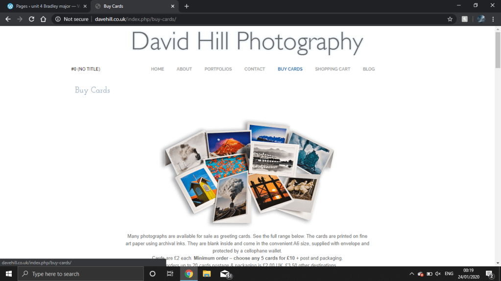
When you first open David hills website you are greeted a massive sign saying David hills photography in big writing i like this but i don’t because seeing this you know who he is but then if you seeing it then you are most likely going to know who he is. You also see a mini slide show that shows i think the photographers favourite photos i really like the idea of this because every time you look at your home page you can see your favourite photos and if anyone stumbles across you website looking for a photographer they get to see the styles you do. Scroll down more you get a bit of information about this photographer like where is he from a little bit about who this photographer is working for and about what he sell like prints and stuff. But the about me page for this photographer is almost pointless because it basically tells us what was on the bottom of the home page. their is also a page where he shows his portfolio but i don’t like this because just so see some of his photos you have to click like 100 times and i don’t like that because i get bored looking. I do like how you can buy his photos because if you see a photo of his you don’t have to contact him you can just buy strait away. Overall i don’t like his website its boring its go no cool animation’s and nothing to keep me interested while going though it.